Colours
Mixing colours tend to be an intimating to many people, and it is normal since most of us are not interior designers by day. That is okay, but as long as we have the resources to help us to at least identify some colours from a colour-matching perspective, it will be much easier, right?
Colour Wheel
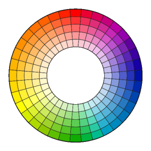
The colour wheel is the tool you would need to understand colours in a general sense. It is like algebra that we have all learnt but we just cannot recall it anyway.
A colour wheel is a visual tool which gives an understanding of which colours blend nicely together. It removes all the guesswork, essentially. If you need, we will share a set of colour wheels for your reference and understanding, so you being one of the “designer” of your space, can have a direct influence on what colours or mood you would like to have.
Alternatively, the colour wheel can also be downloaded directly here, but please be aware of the colours in your computer configuration may not look exactly the same as what the colour is supposed to represent. Most models are comprised of 12 colours. However, in theory, the colour wheel could be expanded to include an infinite number of shades. In summary, if you have specific colours which you would like to have but is unsure of what complementary colours to use, the colour wheel is your best buddy here.

Colour Families
As colours will always be used to complement existing furnishings or trigger a certain mood, it is helpful to understand colour families.
In a colour wheel, typically there are 3 major categories of colours, and these are explained below:
(A) Cool Colours
- Blue, violet and green make up the cool colours. Like the beautiful skies, green forests and the large expanse of water, they evoke a soothing mood and bring a sense of calm to space. As these colours also have the effect of triggering a feeling of receding-ness, it makes a small space seem larger.
(B) Warm Colours
- Warm colours conjure a feeling of, you guessed it, warmness. It gives a feeling of sunlight, sand, fire and closeness, and can usually give a feeling of energy and excitement in a room. It has the ability to make large rooms closer and cosier. On the side of the colour wheel, there are colours of red, orange and yellow. These colours evoke a sense of hotness and stimulation, which explains many famous brands and products like Coca-cola, sports cars and red jackets adopt the red colour.
(C) Neutral Colours
Neutral colour refers to colours which are colour-unsaturated or being without colour. It is still a colour, but it is like a hue that does not compete with any other colours. White, beige, brown, grey, and black make up the neutral colours.
Shades of black, beige, brown, and gold are considered to be warm neutrals. On the other hand shades of white, silver, ivory and cream are usually considered to be cool neutrals.
Neutral colours by itself cannot give any “life” or ambience to any space. But that does not mean it does not serve any purpose. It creates a sense of depth in a space, and usually able to set the foundation for other colours. Because it is neutral, it can “make friends” with everyone and hence can be used with any colours in the colour palette.
Understanding Colours
To understand colours, 3 key elements make up the general framework of understanding towards colours:
(A) Hue
- Hue refers to the identification of a set of pure colour within a colour space. There can also be a mixture of 2 pure colours to become a new hue (Red + yellow = Orange, or Red + Green = Brown). Once a hue is selected, there can be further tweaking to the colour through one of 2 actions:

(B) Brightness (or “Value”)
- This parameter means how light (bright) or dark a colour is. It is usually applied in one of three ways:
- (i) Tint
It is usually lighter than the original colour through adding white to it. - ii) Tone
When grey colour is added to the original colour, it reduces the colour’s saturation through a slight darkening. - (iii) Shade
Under shading, black is directly added to the colour, which darkens the colour more readily than the toning process.
- (i) Tint
(C) Intensity
- Intensity refers to the amount of saturation in the colour.
In the world of interior design, colour is not an exact science. And the combinations are limitless! For instance, red colour on the wall by itself evokes a warm and intensive mood, but once a tint is added, it becomes pink in colour and it immediately creates a feeling of childhood and/or femininity. Add another texture through sponging the red will transform the flat colour to a 3-dimensional feel due to the different tint, tone and shades.
Choosing Colours
When choosing colours, be it an office renovation, retail renovation or restaurants, it is helpful to keep in mind the size and intended business activity of your commercial space. As discussed previously, a warm colour in a small room will cause a little claustrophobia, but this may not exactly apply to hotel rooms, spa treatment rooms and restaurants. It could also be affected by other colours surrounding them.
For instance, while brown is often not the most popular option, it projects an earthy feel. Since the commercial space is projected to be an earth, should we add forests to make it an outdoorsy feel? Forest green colours or even objects such as plants or small trees (whether natural or artificial) can completely give a different projection.
Another example is white in colour. It gives out a clean and chaste feel. Although it is often associated with purity, it could project a sterile and cold ambience like some hospitals. However, it can easily be softened by adding cream or ivory. They are not pure white, but they are more comforting than pure white.
Lastly, we could always use a choice of one dominant colour and adopting 1 to 2 accent colours as a complementary colour. If a dominant colour is decided to be mint green, an accent colour usually comprises 10%-20% (as long as the 2 colours are not in equal proportions). In this case, smokey grey could be an accent colour, which gives out a comforting feel.
Interior design has so many elements which are interconnected. Colours look differently when in natural light compared with artificial lighting. Hence this must be considered in view of the space location and its facing.